World's Greatest Videos
Founding Principal Designer
2018-2021

World's Greatest Videos connects emerging creators with a global audience through a 24/7 video contest, offering a $1,000,000 annual grand prize.
The platform provides a continuous showcase for talent across various genres, allowing creators to submit videos and participate in community voting.
By fostering a vibrant community of global talent and viewers, World's Greatest Videos drives engagement and creativity, rewarding exceptional creators with significant exposure and financial incentives, helping to advance their artistic careers.
Nods
“
Spencer was the cornerstone of our product team. For every feature we considered for our product roadmap, Spencer did research, talked with focus groups and ran usability tests before any implementation started.
Also impressive was Spencer’s ability to manage all aspects of the design team (including the other artists, marketing material, social media content, video composition and editing). When the pandemic hit and the team was forced to work remote, Spencer was able to continue his role and manage his team without skipping a beat.
With Spencer you get a phenomenal product designer who takes pride in ownership of product and the user experience. I would be privileged to work with Spencer again in the future.
Devin A.
VP of Software Development at World's Greatest Videos
“
Nobody on this planet will take care of your company or your users in the way that Spencer Guerra can.
While working under Spencer at World’s Greatest Videos, I was particularly impressed by his creative problem-solving, tireless work ethic, and willingness to do whatever it takes to create a product users will love.
Spencer has a unique way of making users feel comfortable speaking with him. He empathizes with users on a personal level and gives them peace of mind and improves their willingness (and the willingness of others) to share more in the future.
This directly translates to how he manages his team. Spencer knows how to empower our strengths and encourage us in areas where we feel weak. He truly loves what he does. As a team leader, Spencer would be an asset to any team!
Hannah S.
Jr. Product Designer at World's Greatest Videos
Caselet

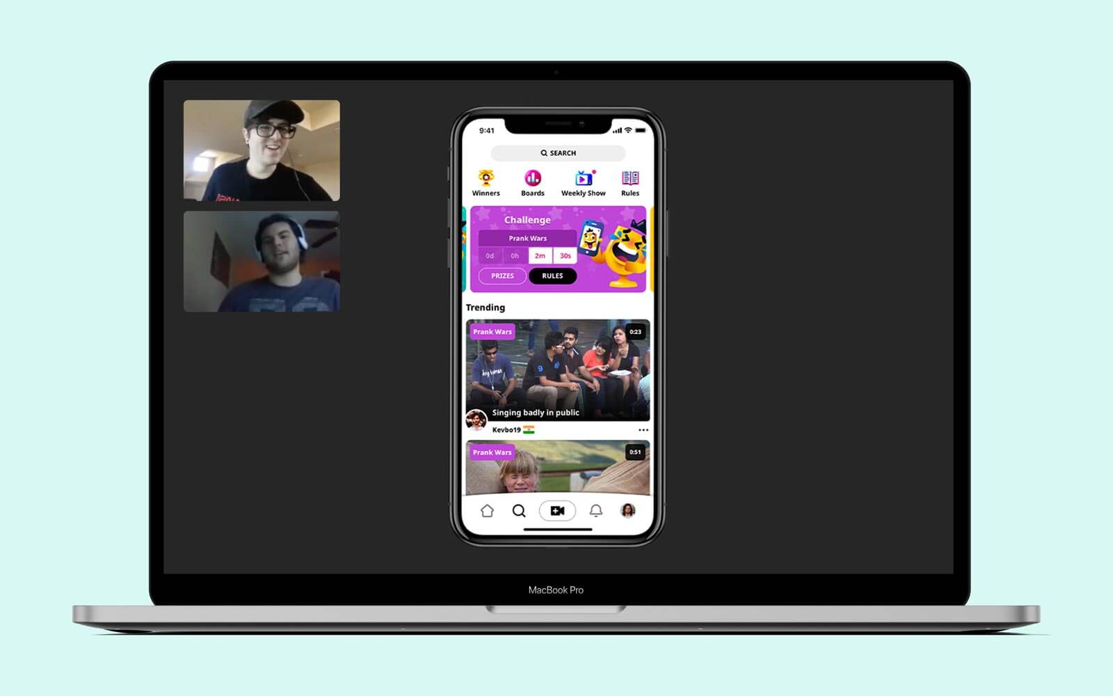
Explore Page
Drives engagement by encouraging uploads through contests and propagating content based on recommendations.
Target Audience
People looking to discover and engage with contests or vote on new videos.
Post-Launch
Analyzing behavior across platforms revealed key trends in contest engagement and adoption that highlighted both opportunities for growth and areas requiring targeted improvements.
High desktop contest uploads
High desktop explore engagement
High app adoption rate
Low app contest uploads
Low app explore engagement

Mobile vs. desktop
Problem Validation
To deeply understand the experience and uncover underlying challenges, I conducted direct calls with individuals who had recently uploaded their first video on mobile.
This approach involved actively listening to and observing their behaviors, frustrations, and workflows. By asking open-ended questions, I encouraged people to share their genuine thoughts and experiences without leading them toward preconceived ideas.
I deliberately avoided discussing my own ideas or making assumptions, ensuring that the insights gathered were unbiased, authentic, and community-centered, laying a strong foundation for informed decision-making.
Listened to and observed people
Asked open-ended questions
Didn’t ask about my ideas
Didn’t make assumptions
Speaking with people from all over the world
The Real Problem
Mobile creators didn’t have a quick way to view all available contests which made it difficult to know when new ones are available
Goal
The percentage of active mobile participants in each contest will equal desktop.
Hypothesis
If mobile creators can see all contests in a single, consolidated view, then they will participate in more contests, which will result in increased engagement and contest submissions.
Solution Validation
I clearly explained the problem, shared my hypothesis, and outlined the goal with the team.
We collaborated on potential solutions, click-testing mockups using UsabilityHub for quick feedback and iteration.
The most promising options were implemented through simple front-end updates and A/B tested with our beta community to gather real-world performance data.

A/B tested solutions
Why This Solution?
Our new approach addressed critical business goals by aligning with community behaviors and optimizing engagement across our most used platforms.
Key outcomes included:
Showing all contests on all devices
Surpassing desktop contest adoption
Increasing contest vote participation
Encouraging singular action
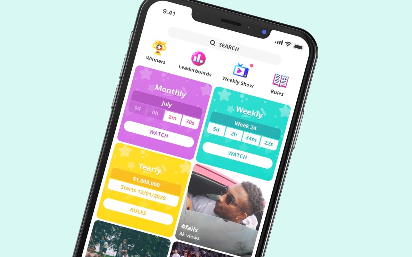
Updated modular Explore feed
Retrospective
Reflecting on the process provided insights into both successes and areas for improvement, making sure future iterations were more effective and streamlined:
Validated assumptions
Surpassed goal quicker through live A/B testing
Low dev impact
Original prototypes biased by static interactions
Steps are skipped when testing too many features